Parcourir les catégories
Explorer
Fiverr Pro
Français
$
USD




Traduction automatique
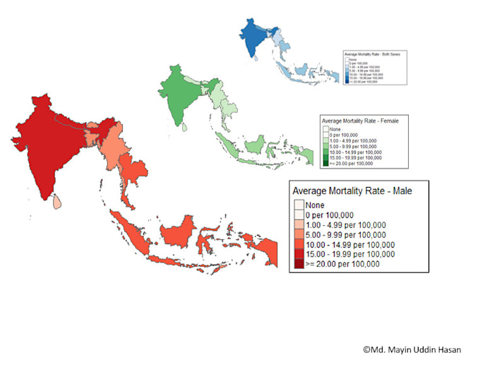
Je réalise des visualisations de données claires et professionnelles adaptées à vos données médicales ou de recherche. Qu'il s'agisse de barres, camemberts, lignes, nuages de points ou boxplots, ou de cartes avancées et interactives globales ou locales, je donne vie à vos données pour des rapports, publications ou présentations. Utilisant des outils comme R, Python, STATA et SPSS, je fournis des visuels de haute qualité qui rendent vos résultats faciles à comprendre et percutants. Livraison rapide et révisions incluses !
Langues
Traduction automatique
Traduction automatique
Quels types de graphiques et diagrammes créez-vous ?
Je crée des graphiques en barres, camemberts, lignes, nuages de points, boxplots, des diagrammes statistiques avancés et des cartes interactives (globales et locales).
Quels formats de données acceptez-vous ?
Je travaille avec des fichiers Excel, CSV, SPSS, R, Python, et plus encore.
Pouvez-vous personnaliser les visuels pour correspondre au style de ma publication ou de ma présentation ?
Oui ! J'adapte les couleurs, les polices et la mise en page selon vos besoins spécifiques.