Parcourir les catégories
Explorer
Fiverr Pro
Français
$
USD
Raising the bar since day one!
Compétences
Voir mes services
| (19) | ||
| (0) | ||
| (0) | ||
| (0) | ||
| (0) |

jonathanjoshuan

États-Unis
Sharp, focused, and elegantly designed. Silver and icy blue create a crisp, premium look. Typography is clean and well-paired. Great for branding across all platforms.

Réponse du freelance
cordellmccallu

Allemagne
Strong and elegant, the valkyrie design is beautifully crafted. Silver and blue tones feel noble and fearless. Typography's regal touch fits the warrior theme perfectly. Great for team and personal branding alike.
Réponse du freelance

rosedenbyw

Royaume-Uni
Strong and disciplined design, great team branding potential. Color palette feels militant and cohesive. Typography works seamlessly with the design. Highly professional and versatile for multiple platforms.

Réponse du freelance

elmsworth
Royaume-Uni
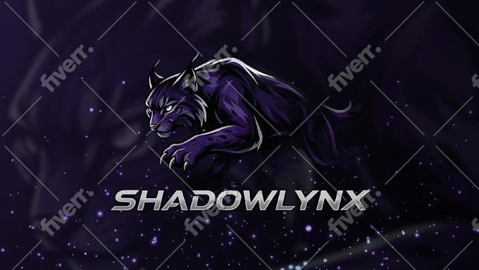
Elegant and stealthy, perfectly captures the lynx's agility. Purple and silver tones are sophisticated and balanced. Typography is sharp and professional. Highly versatile and impactful across digital platforms.
Réponse du freelance

warblemoor
Royaume-Uni
Heroic and elegant, the space-knight concept is beautifully done. Blue and gold combo feels noble and futuristic. Typography adds a regal touch that fits perfectly. Excellent for branding across every platform.

Réponse du freelance