Parcourir les catégories
Explorer
Fiverr Pro
Français
$
USD



Turn your raw data into clear, professional charts and graphs
You have data in a CSV or Excel file. You need charts that look professional for a report, presentation, thesis, or publication.
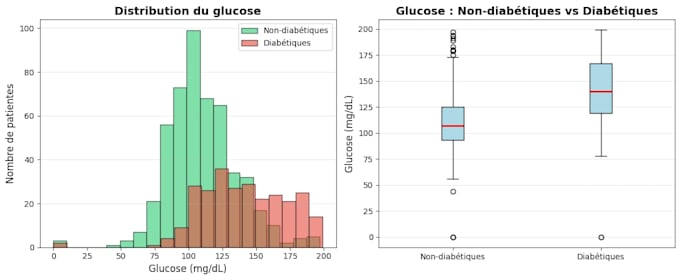
What you get: Up to 5 custom visualizations (Standard package) Charts adapted to your data: bar, line, pie, scatter, heatmap, boxplot High-resolution PNG files (print-ready) Python code so you can reproduce or modify them Clean, labeled, publication-quality graphics
Perfect for: Students writing a thesis or report Researchers needing publication-ready figures Small businesses wanting to understand their data NGOs presenting results to donors
Just send me your file and tell me what story you want to tell with your data. I handle the rest.
See examples: kaggle.com/arafathtchaledji
I will analyze your medical or health dataset with Python and visualizations
Langues